Ideas, issues, knowledge, data - visualized!
- Home
- Hello
- Visualizations
- Horoscoped
- Google NGram Experiments
- The Varieties of Intimate Relationship
- Wikipedia’s Lamest Edit Wars
- The Billion Dollar-o-Gram 2009
- Because Every Country Is The Best At Something
- Colours In Cultures
- Cover Versions
- What Does China Censor Online?
- Snake oil? Scientific evidence for health supplements
- When Sea Levels Attack
- The Billion Pound O Gram
- Climate Change Deniers vs The Consensus
- 2012: The End Of The World?
- Left vs Right (World)
- Left vs. Right (US)
- The Hierarchy Of Digital Distractions
- Timelines: Time travel in popular film and tv
- The Billion Dollar Gram
- Caffeine and Calories
- Reduce Your Chances of Dying in a Plane Crash
- Drugs World
- Mountains Out of Molehills
- Play
- Books
- Data
- Help!
- Contact
- Store
How Many Alien Civilizations are there in the Galaxy?
September 5, 2012

Are we the only intelligent, communicating civilisation in the galaxy? Tweak the statistical probabilities of the ‘Drake Equation’ and find out.
A nice little interactive visualization we did for the BBC.
(It’s only viewable to people outside the UK. Unless you’re running something like <cough>Tunnel Bear</cough>)
concept & design: David
McCandless
additional design: Piero Zagami
code: Chambers Judd
exec creative direction: Duncan Swain
research: Marley Whiteside
sources: Wolfram Alpha, University of Berkeley, Wikipedia – Drake Equation, NASA
additional design: Piero Zagami
code: Chambers Judd
exec creative direction: Duncan Swain
research: Marley Whiteside
sources: Wolfram Alpha, University of Berkeley, Wikipedia – Drake Equation, NASA
Posted in interactive,
Originals
| Tagged infographics,
science,
space,
technology |
Leave a comment
Leave a comment
Announcing our visualization awards shortlist…
August 21, 2012

I’d like to invite you to review the official shortlist of the inaugural Information is Beautiful Awards.
Our global contest is out to showcase excellence in data visualization and infographics. I think the list shows off some of the best work of the last year.
Over 1,000 entries from 16 countries were agonizingly whittled down to a 300 strong longlist. (It makes a great browse if you’re looking for inspiration or to trawl trends).
Big thanks to everyone who entered and supported. Such a great honour to see so much flourishing creativity in one place.
Then, with much toil and heartache, we managed to boil down each of the six categories to a shortlist – of the best, most representative, most emblematic and most excellent work.
See for yourself
» Data visualization – A singular visualisation of data or information.» Infographic – Using multiple data visualisations in service to a theme or story
» Interactive visualization – Any viz where you can dynamically filter or explore the data.
» Data journalism – A combination of text and visualizations in a journalistic format.
» Motion infographic – Moving and animated visualizations along a theme or story.
» Tool or website – Online tools & apps to aid datavizzing.
what happens next?
Right now, our awesome judges – including legendary artist Brian Eno, MoMA curator, Paola Antonell and myself – are reviewing the work and making their selections.Alongside our beloved sponsors Kantar, we’ll be announcing the winners at a ceremony in London on September 27th and giving away $30,000 in prize money.
7-way Venn
July 13, 2012
Punytive Damages? World’s Biggest Corporate Fines
July 6, 2012

Bad week for mega-corps. GlaxoSmithKline facing a $3 billion settlement for fraud (link) . Barclays hit with a $450 million penalty for manipulating interest rates (link).
But are these punishments proportional to the crime? After all, one company’s million-dollar fine is another corporation’s small change.
We’ve gathered and visualized the biggest corporate fines of the last seven years, not just as raw amounts, but also as a percentage of each company’s profits. That way you can see for yourself if the punishment was painful or puny…
See the visualization
See the data
These settlements are scattered and hard to find. So let us know if we missed any.
concept & design: David
McCandless
additional design: Kathryn Ariel Kay, Piero Zagami
research: Dan Hampson, Christian Miles
sources: various company reports & media stories (NY Times, BBC, The Guardian, The Washington Post)
data: http://bit.ly/punytive
additional design: Kathryn Ariel Kay, Piero Zagami
research: Dan Hampson, Christian Miles
sources: various company reports & media stories (NY Times, BBC, The Guardian, The Washington Post)
data: http://bit.ly/punytive
Final Call for Entries to our Infoviz Awards
May 29, 2012
The final entry date for our visualization awards is 31st May.
If you haven’t already submitted some work, here are five reasons to enter:
1) Entries will be judged by a stellar jury which includes Brian Eno.
2) There’s over $30,000 in prize-money to be handed out.
3) It’s the world’s first global information visualization awards.
4) Longlisted entries will be exhibited online.
5) It only costs $10 to enter.
Submit your entry now.
And feel free to nominate any pieces of work you think should be entered. Comment below or email.
Big thanks to Kantar for such a generous prize pot.
» Find full details, timings, categories and miscellania
Chicks rule?
May 22, 2012

Back in 2010 we calculated there were 74 million more women on social networks than men. We’ve had a fresh look at the data. In the age of Facebook, Pinterest and Instagram, do chicks still rule?
» See the new diagram
» See the old diagram
DESIGN: David McCandless
RESEARCH: Dan Hampson
ADDITIONAL DESIGN: Piero Zagami, Tatjana Dubovina
SOURCE: Google Ad Planner
DATA: BIT.LY/CHICKSRULE
RESEARCH: Dan Hampson
ADDITIONAL DESIGN: Piero Zagami, Tatjana Dubovina
SOURCE: Google Ad Planner
DATA: BIT.LY/CHICKSRULE
Brian Eno to judge our $30,000 data visualization awards
April 12, 2012
So we’re running the world’s first
global awards, celebrating excellence in data visualizations,
infographics and information art. Yeah!
Kind sponsors Kantar have laid $30,000 on the table to reward the winners and celebrate the field.
Here’s the complete roll call. See their bios and details.

Yes, the final judge is you! We’ll be inviting you and the online infoviz community at large to vote on entries and become a single ‘meta-judge’ on our panel.
Long- and short-listed entries will be exhibited here and on the awards site. So your work will be seen by many, many eyes. Winners will win cash prizes, a unique trophy and mondo kudos.
Closing date: 31st May 2012.
Long list: 25th June 2012.
Short list: 9th July 2012.
Winners: by 31st July 2012.

Submit your entry today. Best of luck!
Kind sponsors Kantar have laid $30,000 on the table to reward the winners and celebrate the field.
Who are the judges?
Excitingly, we’re super-honoured to welcome Brian Eno to our judging panel. He joins senior curator at the MoMA Paola Antonelli, The Guardian Datablog’s editor Simon Rogers and um, myself David McCandless.Here’s the complete roll call. See their bios and details.

Yes, the final judge is you! We’ll be inviting you and the online infoviz community at large to vote on entries and become a single ‘meta-judge’ on our panel.
Who can enter?
It’s open to all comers – pro and ‘amateur’, individual, team or studio, media, art, corporate – whatever, where ever. This is a truly global contest.Long- and short-listed entries will be exhibited here and on the awards site. So your work will be seen by many, many eyes. Winners will win cash prizes, a unique trophy and mondo kudos.
Where and when to enter
So if you’re making viral infographics, vizzing statistics, campaigning with data journalism, rendering geo-data, designing your company’s internal processes – submit your entry today. It costs just $10 to enter. That means it won’t cost a chunk to have your work seen and lauded.Closing date: 31st May 2012.
Long list: 25th June 2012.
Short list: 9th July 2012.
Winners: by 31st July 2012.
Categories and prizes
Somewhat inevitably here’s an information graphic that explains all the categories and prizes.
Submit your entry today. Best of luck!
3D Infographic Projection Mapping in Grand Central Station!
March 26, 2012

Fancy seeing the world’s first 3D projection-mapped infographic animations?
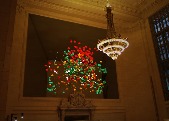
Along with ad agency DDB London and the Financial Times, we helped gather data and shape some of the stories for three short infographic films which will be projection-mapped on the inside of Grand Central Station in New York! Go see!
(Projection-mapping throws a 3D model of an environment or space back on itself in order to pull off some incredible visual effects).
I’ve not seen the finished films yet. They’ll be unveiled tomorrow (Tuesday 27th March) and run continuously for three days. Hashtag #FTGW. But project-mapping ninjas the Klip Collective have an incredible reputation for large scale awesomeness.
There’s a preview (and a picture of me doing Karate) running at http://www.ft.com/graphicworld.

Hollywood Visualizations
February 24, 2012
 Amazing
response to our Visualise
Hollywood Challenge. Just in time for the Oscars!
Amazing
response to our Visualise
Hollywood Challenge. Just in time for the Oscars!Slice, dice and flip data on budgets, review scores and genre with these interactive visualisations.
- Filmstrips by Tom Evans – Slick and elegant chopping board of data points
- Movies & Magnets by Erik Boertjes- Use virtual ‘magnets’ to attract films of your choosing.
- Hollywood Data Explorer by James Fisher – Simple and effective filtration mechanism.
- What movie should we watch tonight? by Balazs Krich – This tells you everything. And even plays the trailers.
- Hollywood Budgets by Daniel Leventhal – Stunning Silverlight mega-viz – worth a look!


No comments:
Post a Comment